DJI Mavic, Air and Mini Drones
Friendly, Helpful & Knowledgeable Community
Join Us Now

Plot a graph from data in a csv, any software recommendations? Thanks.

  • Thread starter Deleted member 103366
  • Start date
D

Deleted member 103366

Guest
I have a log'book' ( a csv) that summarises every flight for which I have a .txt flight log. One of the columns represents the difference in height of the take off point and the landing point. The 'column' was actually intended to 'measure' barometer 'drift' over the course of the flight but it is proving to have other uses as well.
I would like to plot a graph of the number of times a given height difference occurs (y axis) against the corresponding recorded height difference (x axis).
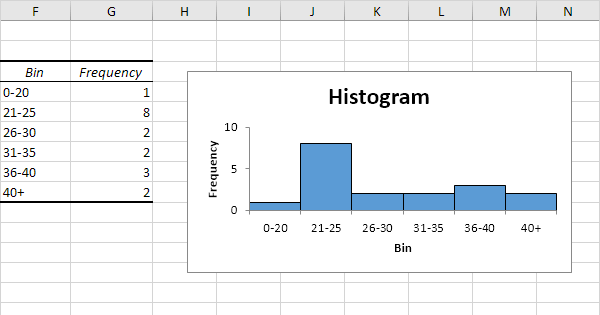
To me "graph" means a line passing through or near the intersection of the coordinates.
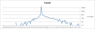
It would be easy enough to do on paper if there were only a few flights logs but I have 2800+ flight logs and there are a great number of height differences values. Excluding obvious wonky values they range between +-300+ ft. As expected/hoped-for the vast majority are concentrated near 0, zero.
I think I can come up with a script to count the number of occurrences of each height difference, if so I can create another csv which contains only the recorded height differences values and the number of times those values occur, this may drop the number of coordinate pairs to a few hundred or less. I am looking for recommendations for free software to plot the results.
From memory the increment in recorded height differences is 10cm and there are large swathes of 'unused' height differences, I think it might be better to plot only the recorded height differences on the x axis rather than plot every plausible value.
Thanks
 
That's a simple histogram plot that any data analysis program should be able to create, including counting the instances. You don't even need to create your own script. For example, in Igor Pro the parameter settings would look like this:

1635604119939.jpg

If you want to post your CSV then I can show you what the output would look like.
 
That's a simple histogram plot that any data analysis program should be a..............

If you want to post your CSV then I can show you what the output would look like.
Cheers Sar104, I will look into getting the csv ready for you but I have the recollection csv's are not accepted by the forum, if I am correct it would have to be sent via email.
 
I will give that a go but it is likely to be tomorrow before I have access to the file.
 
Excel is also reasonably powerful; it's been a while since I've used it for more complex analysis, but if you don't have a Linux box to run sar's tool...

 
Ahhh a histogram is not what I seek, I want a line that changes height as you move along the x axis. I think it's going to end up like a Gauss Curve but wouldn't be surprised to see two minor peaks, one either side of the main peak, corresponding to the difference between ground level and hand level.
 
Ahhh a histogram is not what I seek, I want a line that changes height as you move along the x axis. I think it's going to end up like a Gauss Curve but wouldn't be surprised to see two minor peaks, one either side of the main peak, corresponding to the difference between ground level and hand level.
That's still a histogram. How you represent it, whether a line, line between points, or vertical bars, is entirely optional.
 
sar beat me to it ... lol.

You are describing a histogram - just one with a lot more data than the example I offered. You simply plot the value of the histogram bins, with some smoothing.

lightroom-cc-classic-what-is-the-histogram-300x300.png
 
A line graph implies a relationship between the x and y axis variables. For example, if x axis is time, y axis could be temperature or how much you weigh, or the stock market. It shows how things change or have changed over time (or something else that changes, on the x axis; like signal strength to distance from transmitter).

What you are describing is two variables with no (known) direct relationship (count and variance); this is the classic case for a histogram, or if you SUSPECT a correlation between the two, a scatter plot.

You can do all these in Excel (and other tools... I just happen know/use Excel). You'll have to first 'bucket' your variance values into ranges.
 
Let's see if this works.....EDIT. it seems to.
 

Attachments

  • for Sar104 .txt
    10.6 KB · Views: 5
Do you want a bin for every value? Or can the data be binned into a small range, like 0.5?

Plus, the data is a bit problematic, there are 1795 zeros, and everything else in tens. So scaling is difficult. And, negative values don't do log well. So some clipping is needed to make a plot useful:

1635704927684.png
1635705423516.png

Non-clipped:

Untitled.png

Key data is near zero:

23.0​
1.0​
21.0​
0.9​
32.0​
0.8​
25.0​
0.7​
29.0​
0.6​
34.0​
0.5​
43.0​
0.4​
42.0​
0.3​
68.0​
0.2​
129.0​
0.1​
1795.0​
0.0​
65.0​
-0.1​
41.0​
-0.2​
29.0​
-0.3​
19.0​
-0.4​
15.0​
-0.5​
16.0​
-0.6​
14.0​
-0.7​
11.0​
-0.8​
16.0​
-0.9​
6.0​
-1.0​
 
Last edited:
For the entire range please but the count for each value against that value, if you see what I mean. I am not seeking every single record plotted separately.
 
Thanks, following on from your post #6 I have just found the "remove duplicates" and "=countif" things in excel.
I got the output of that almost at the same time as you edited the above post.
It really makes the difference in frequency stand out.
 
The data range is -139.2 min to +119.0 max.

At 0.1 resolution, that's thousands of points. So you will have every point plotted separately, except that central region where the count jumps from 0 to 1700. So clipping the data to the range of interest seems to make the most sense.
 

Attachments

  • Sar104.zip
    87.2 KB · Views: 0
Do you want a bin for every value? Or can the data be binned into a small range, like 0.5?

Plus, the data is a bit problematic, there are 1795 zeros, and everything else in tens. So scaling is difficult. And, negative values don't do log well. So some clipping is needed to make a plot useful:

View attachment 137551
View attachment 137553

Non-clipped:

View attachment 137549

Key data is near zero:

23.0​
1.0​
21.0​
0.9​
32.0​
0.8​
25.0​
0.7​
29.0​
0.6​
34.0​
0.5​
43.0​
0.4​
42.0​
0.3​
68.0​
0.2​
129.0​
0.1​
1795.0​
0.0​
65.0​
-0.1​
41.0​
-0.2​
29.0​
-0.3​
19.0​
-0.4​
15.0​
-0.5​
16.0​
-0.6​
14.0​
-0.7​
11.0​
-0.8​
16.0​
-0.9​
6.0​
-1.0​

And that illustrates how Excel sucks at data analysis and representation. This isn't a task for a spreadsheet application.
 
And that illustrates how Excel sucks at data analysis and representation. This isn't a task for a spreadsheet application.
Actually got to that rather fast in Excel. Not as good as MathCAD or MatLab - but free was mentioned. And there are free alternatives to Excel like Google Sheets. And PF wanted a line plot, not a pure histogram. lol.
 
Actually got to that rather fast in Excel. Not as good as MathCAD or MatLab - but free was mentioned. And there are free alternatives to Excel like Google Sheets. And PF wanted a line plot, not a pure histogram. lol.
Yours was also a histogram, not a line plot. Joining the dots doesn't change the analysis - it just distorts the data by obscuring the zero bins.
 
Yours was also a histogram, not a line plot. Joining the dots doesn't change the analysis - it just distorts the data by obscuring the zero bins.
Not sure that is entirely true - I let the bottom scale be 1 on the log plots, zeros are not plotted (seen as gaps in the line); the linear plots all show the zeros.

1635791588462.png
 

Attachments

  • 1635791420186.png
    1635791420186.png
    17.9 KB · Views: 1
Lycus Tech Mavic Air 3 Case

DJI Drone Deals

New Threads

Forum statistics

Threads
130,984
Messages
1,558,584
Members
159,978
Latest member
James Hoogenboom