DJI Mavic, Air and Mini Drones
Friendly, Helpful & Knowledgeable Community
Join Us Now

Which COMPOSITION do like better?

Which image has the better composition? (ignore image quality)

  • Image A

    Votes: 13 68.4%
  • Image B

    Votes: 6 31.6%

  • Total voters
    19

vindibona1

Well-Known Member
Joined
Jun 21, 2020
Messages
3,977
Reactions
3,962
Location
Democratic Peoples Republic of Crook County
The following twin image Photo contains two variations of the same setup. Ignore any retouching or photographic imperfections as the point of the polling is purely regarding composition.

Essentially the picture in image A is higher than the one in image B. Which do you like better- AND WHY?

Please vote in the poll and provide your thoughts on why you've picked one over the other for COMPOSITION.
TIA
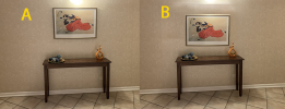
1639684227020.png

P.S. Sorry that this isn't a drone photo, but this is the only forum I subscribe to that I knew to post this question on.
 
A..is more centered on wall and don’t have to look down to see
the picture. Only thing with A is that light. The glare. 🤷‍♂️
 
  • Like
Reactions: old man mavic
@vindibona1 based purely on composition A is always going to be better ,its very similar to the way we use the grid lines on our drones to compose a picture
 
  • Like
Reactions: dirkclod
A has been cropped subtly and tilt adjusted to the right slightly, looks better to my eye.
I really don't like what's done to B up top with the light there, prefer the straight out glare of A.
LOOK AT **PICTURE ****POSITION**** ONLY**! There is no glare in person. I’m not worried about the lighting or the glare any of that only wear the picture is in regards to the setting.
 
My own personal take... The image with the lower picture is more congruent to the setting. When the picture is higher the scene looks a bit "dismembered". It is my opinion that the group with the lower picture is a singular look. When the picture is higher, there are at least two, maybe three items that compete separately for attention.

I've posted this to see what others might see that I'm not. Unfortunately so far the lighting has been commented on, but not so much the compositions, which is the main and only purpose of this exercise.
 
  • Like
Reactions: Kilrah
@vindibona1 have to disagree somewhat with you there
for me the picture A looks more natural and balanced
of course these things are subjective ,like art itself
and when we look at a picture we all see slightly different things
 
  • Like
Reactions: dirkclod
@vindibona1 have to disagree somewhat with you there
for me the picture A looks more natural and balanced
of course these things are subjective ,like art itself
and when we look at a picture we all see slightly different things
I agree. But when I look at picture A I see lots of wall. To me it's a distraction and separates competing centers of interest.
 
  • Like
Reactions: Kilrah and MS Coast
@vindibona1 well thats quite a unusual statement ,because to me the amount of wall on view is virtually the same in both pics
what i think you are trying to get at here is something called a focal point
where you eyes are drawn to a specific area of a picture
but of course i could be wrong
but it has been fun discussing this thread as a change from the usual topics on the forum
 
  • Like
Reactions: hiflyer201
I prefer the lighting of B, it seems darker to me than A or maybe more atmospheric than A.....but......B looks a bit cluttered as the painting is almost behind the thing on the right.
 
If my vote counts I like B a lot better then A
I think a short person looking at B would like it better as they don't have to look up. LOL
 
Last edited:
LOOK AT **PICTURE ****POSITION**** ONLY**! There is no glare in person. I’m not worried about the lighting or the glare any of that only wear the picture is in regards to the setting.

All good, not sure what the heck you want, but I'm certainly not being yelled at for making an opinion on your post.

Edit, I read the following posts, and you really didn't make it clear in the OP . . .

"Essentially the picture in image A is higher than the one in image B. Which do you like better- AND WHY?"

Higher positioned on the wall !! Not higher in the photos themselves.
 
  • Like
Reactions: dirkclod
B, also find there's too much gap in A. Would crop it a bit more though since the extra space at the top is now unnecessary.
 
Image A is a better setup. The picture is too crowded to the table and the items on the table in Image B.
 
I'd pick A because there isn't so much empty space at the sides, but if it were my photo I'd also level it and edit out the glare from the lamp.
 
Perhaps y'all are changing my mind a bit. I don't like A at all, but perhaps a compromise position with the picture being somewhere in between as you're getting me to rethink B. Keep in mind that B is a quickly (and haphazardly) Photoshop mock-up to help determine the best position for the picture.
 
"B" redone without the glare.
Good for short people
 

Attachments

  • 1639684227020.jpg
    1639684227020.jpg
    144.4 KB · Views: 6
I prefer A but I feel the composition on the table is wrong. it needs one more element. but then...what do I know :confused:
 
Between the 2, I like A. It looks more natural. Something is just off with B. Somehow it doesn't look "real".

To be perfectly honest... I don't like the composition of either of them. It's hard to ignore the lighting which I'm not a fan of. However, I'm no artist so I just like what I like.
 
Lycus Tech Mavic Air 3 Case

DJI Drone Deals

New Threads

Forum statistics

Threads
130,994
Messages
1,558,711
Members
159,982
Latest member
PetefromNZ