

Hey Guys, Does anyone else have an issue seeing the battery % on the "DJI FLY " app ? Most of the time I struggle to see the battery % when flying... So small and hard to see also it changes depends on the shy color on the phone too! Thanks Guys!
You are using an out of date browser. It may not display this or other websites correctly.
You should upgrade or use an alternative browser.
You should upgrade or use an alternative browser.
Mavic Fly App Battery % Question
- Thread starter harleymhs
- Start date

timinator
Well-Known Member
You can also touch it for battery info. That's what i do considering i am now at a certain age where, like you, it becomes tough to read
Thanks! But I know when u hit the battery the battery info pops up. not sure if it tells u the % ... it tells you voltage etc ... correct? Not the Battery %

EyesWideShut
Well-Known Member
The text for the satellites and battery % is difficult to read against the sky or clouds. I think it was @OMM who tilts the camera gimbal down to check the battery % etc. so the ground becomes the background and the white text shows up much better. Sure hope that text problem is updated soon.
You're right the detailed battery info doesn't show the percentage. The green in each of the cell icons gives a good indication what's left (similar to percentage) and a more accurate display of battery balance and voltages. Also as high heat damages batteries and with the hot days of summer coming, keeping an eye on the temperature is a good idea to maybe fly a little slower to maximize battery health.
Th3DroneroGT
Well-Known Member
DJI Fly interface is very nice without the strip that had the DJI GO 4 on top, but it is a problem to see the number of satellites, the battery. Now in the latest version 1.0.8, I change the size of the number of satellites to bigger but I have the problem that in white clouds the number gets confused.
DJI has to improve a lot the DJI Fly app, at the moment I see it very limited compared to the DJI GO 4
It doesn't have the compass interference meter, which I personally find very useful.
It doesn't have a battery adjustment feature.
It doesn't have a mode switch for GPS, SPORT, OPTI and ATTI
I think that 6 months since DJI Fly came out is a lot and what a shame that even so the DJI GO 4 is still better, I have my suspicions that when the Mavic Air 2 comes out it will give more improvements to the APP.
Fernando_CWB
Member
I have already posted a message at DJI Forum about this issue, that at my point of view, is a weakness of DJI Fly.
I hope also that with the use of DJI Fly by the new Mavic Air 2, they will improve the visibility of the upper information at the screen of the app.
????
I hope also that with the use of DJI Fly by the new Mavic Air 2, they will improve the visibility of the upper information at the screen of the app.
????
I have already posted a message at DJI Forum about this issue, that at my point of view, is a weakness of DJI Fly.
I hope also that with the use of DJI Fly by the new Mavic Air 2, they will improve the visibility of the upper information at the screen of the app.
????
I was going to try the New Mavic air 2 , but when I found out it uses the Fly APP I may not even bother and just use my Spark and Mavic 2 Pro ... They both use the DJI GO app... Shame on them using that SMALL tiny unseeable battery % !
the white lettering that is difficult to see is not the only issue with the fly app,it also needs to be optimised for the IOS version so it fills the screen on larger ipads,like the GO4 app does
How did they put this APP out when the most important thing to see when flying a drone is your battery % .. Wow DJI ...
I'm sure DJI could fix this. I totally agree the problem is a pain. Hopefully they're aware.
Fernando_CWB
Member
I saw that this week was released the Dji Fly version 1.1.0 and I do not see any relevant modification at the visility of the upper information.
If the number of satellites is important to take off, why not make this information clearly visible?
An option could be to highlight it in the same way as when you click on the battery and the data is shown in a small box.
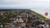
Wenn we fly at a cloudy day, as the picture below, this information are really difficult to see. The number of satellite has a white font and it is so small that it is practically invisible.
This is a point we have to keep claiming.
If the number of satellites is important to take off, why not make this information clearly visible?
An option could be to highlight it in the same way as when you click on the battery and the data is shown in a small box.
Wenn we fly at a cloudy day, as the picture below, this information are really difficult to see. The number of satellite has a white font and it is so small that it is practically invisible.
This is a point we have to keep claiming.
Attachments
it has been optimised for ios so now the white info has a black background ,dont know about the android versionI saw that this week was released the Dji Fly version 1.1.0 and I do not see any relevant modification at the visility of the upper information.
If the number of satellites is important to take off, why not make this information clearly visible?
An option could be to highlight it in the same way as when you click on the battery and the data is shown in a small box.
Wenn we fly at a cloudy day, as the picture below, this information are really difficult to see. The number of satellite has a white font and it is so small that it is practically invisible.
This is a point we have to keep claiming.
Herbie
Active Member
Just updated still the same. Cannot see the batt%it has been optimised for ios so now the white info has a black background ,dont know about the android version
Fernando_CWB
Member
It was optimised just to tablet screens. For mobiles screens, it is still the same.it has been optimised for ios so now the white info has a black background ,dont know about the android version
Herbie
Active Member
?It was optimised just to tablet screens. For mobiles screens, it is still the same.
Fernando_CWB
Member
Hello,
Just to be fair with Dji, they have done an improvement at the version 1.1.0 of the Dji Fly.
For this version is visible a light change in the battery icon, which has become a little more visible, although still represented in white.
See some pictures taken today using the new App at an iPhone 6.


I don't understand why the satellite icon is so small. If the ideia from Dji is to keep the interface clean, they could use the same proposal that was used at the battery, where the data is shown more detailled (battery voltage, temperature) when we touch at the icon.
Just to be fair with Dji, they have done an improvement at the version 1.1.0 of the Dji Fly.
For this version is visible a light change in the battery icon, which has become a little more visible, although still represented in white.
See some pictures taken today using the new App at an iPhone 6.
I don't understand why the satellite icon is so small. If the ideia from Dji is to keep the interface clean, they could use the same proposal that was used at the battery, where the data is shown more detailled (battery voltage, temperature) when we touch at the icon.
Similar threads
- Replies
- 5
- Views
- 520
- Replies
- 3
- Views
- 379
- Replies
- 8
- Views
- 660
- Replies
- 9
- Views
- 641


DJI Drone Deals
New Threads
-
 Air 3 Pebbly Beach - Mid North Coast, Black Head NSW, Ausralia.🦘🇦🇺
- Started by Squidinc
- Replies: 0
-

-

-
-
 Yx DJI Mini 3 Pro Mini 3 Mini 4 Pro Charger Hub with Color LCD Display
- Started by Dogpilot
- Replies: 0
Forum statistics