DJI Mavic, Air and Mini Drones
Friendly, Helpful & Knowledgeable Community
Join Us Now

Interesting client...

Donnie Frank

Well-Known Member
Joined
Sep 21, 2017
Messages
531
Reactions
375
Age
61
Location
Albuquerque, N.M.
Hey doods!

So an Electrical Contractor buddy of mine recommended my aerial photography company to one of his clients. They install parking lot lights so they want before and after shots. Unfortunately, they had hired another drone company to do the before shots. When I asked the POC if they had anything in mind, she showed me the before shots the other photographer took. She screenshot them from her computer.
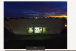
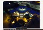
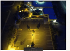
image003.png

image002.png

image001.png

I expressed concern with the color, exposure and composition of the "before" photos. I told her that, while I could certainly imitate these shots, I think it would be her best interest if she just allowed me to shoot the photos "properly." She gave me license to shoot the property any way I wished.

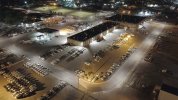
After a few weeks of windy nights, I finally got to shoot last night. We discussed deliverables and they were happy with jpegs. I provide a single shot only.
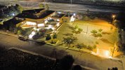

TramwayLibrary_HDR-2.jpg

The last two jobs I have done for this client she was very happy. I assume she'll be happy with this one.

It's kind of mind blowing that the client was satisfied with the before shots. They look absolutely horrid to me. And FYI, the roof is blue NOT because of LED lighting. That is due to some kind of weird color grading....and/or white balance issues. Who knows....

Shot with a Mavic Pro using 5 bracketed RAW photos.

D
 
Last edited:
The question is what they need to see. While your photo is clearly superior in all technical aspects, their photo more accurately reflects how the parking lot illumination is seen by people on the ground.
 
The question is what they need to see. While your photo is clearly superior in all technical aspects, their photo more accurately reflects how the parking lot illumination is seen by people on the ground.
Hmmmm....I don't see that. The shots given to me are aerial shots, not ground shots. How do those shots "more accurately" reflect anything? Honestly, IMHO, those shots don't tell the story. The close up of the building doesn't even show the parking lot (which is the focus of the story). The shot of the library window shows the user nothing. And the oblique shot of the building and parking lot are certainly not worthy or a corporate portfolio. We may have to agree to disagree.

D
 
  • Like
Reactions: Torque
I actually like the original photos personally. The one where where you can see into the library with the sunset is wicked. I like the darker exposure, I think the soft highlight rolloff is nice. I think the mixed lighting is also really cool and that can be really tricky do right. If your photo is a accurate representation of the lighting color temperature then yes that blue was a color grade to make the mixed lighting effect in which case I’ll be even more impressed but I agree I would have brought down the blue saturation a tad but I don’t think it looks bad.

I’ll agree that if the focus was on the parking lot not including a wide shot like yours was a mistake but the photos that are present are pretty good. By no means horrid. Idk different strokes for different folks I guess. You did a good job at realizing they needed a wide shot to go with this collection.
 
I actually like the original photos personally. The one where where you can see into the library with the sunset is wicked.
I agree that it's pretty. But it doesn't show the parking lot. The company who hired me installs parking lot lighting. The photo they wanted was for a few reasons, but I assume forensics is one of them. 10 years from now my photo gives them the "lay of the land." And I also assume these photos are to be used in a portfolio to show how "bright and safe" the parking lot is. So of course the photo also has to be clear, sharp, well exposed, color accurate, etc.


I like the darker exposure, I think the soft highlight rolloff is nice. I think the mixed lighting is also really cool and that can be really tricky do right.
While I agree the cool colors and warm colors pushed in processing look "pretty," it not accurate. A purple roof, while pretty, is NOT the color of the roof. And a purple sky, while pretty, is not the color of the sky. I literally thought the roof had purple LED lighting. Imagine my surprise when I found out there was no such lighting.


If your photo is a accurate representation of the lighting color temperature then yes that blue was a color grade to make the mixed lighting effect in which case I’ll be even more impressed but I agree I would have brought down the blue saturation a tad but I don’t think it looks bad.
Agreed that it is aesthetically "pretty," but it's not accurate.


I’ll agree that if the focus was on the parking lot not including a wide shot like yours was a mistake but the photos that are present are pretty good. By no means horrid.
We can agree to disagree. Push processing colors into a photo that don't exist (read, over saturation) is great for photos of colorful birds or flowers to be shared on Facebook, but it has no place in forensic architectural photography - especially when color accuracy and exposure are an important part of the product - like parking lot lights. If I were shooting beauty "artistic" shots for a magazine, I would take artistic license with the color. But if you're selling a brown car, you can't make it purple for the advertisement.


Idk different strokes for different folks I guess. You did a good job at realizing they needed a wide shot to go with this collection.
I think most photographers will agree that understanding what the client wants is half the battle. I find that it's easier to simply ask what they're going to use the photos for. But who knows? I am by no means a perfect photographer. The fact that I shot two previous sites with the same composition and color accuracy with great praise from the client makes me think I should stick with that formula.

Here's another site. As you can see, this site's lighting has a few different color temperatures. Since the product is literally lighting, I made color accuracy a top priority.

1656514463557.jpeg

D
 
In a certain way, since the client wanted before and after shots of their lighting improvements, I might have taken the exact same shots as the before, not to demonstrate MY photo expertise, but what their lighting did for their client.
THEN, I might take what I perceive as improved photography (which would be YOUR photos) to show them what they might have received if they hired me to do BOTH before and after.
Even if they did not express it to you, there must have been some degree of dissatisfaction with the first pilot, else why would they hire you.
 
  • Like
Reactions: Mike M
Hmmmm....I don't see that. The shots given to me are aerial shots, not ground shots. How do those shots "more accurately" reflect anything? Honestly, IMHO, those shots don't tell the story. The close up of the building doesn't even show the parking lot (which is the focus of the story). The shot of the library window shows the user nothing. And the oblique shot of the building and parking lot are certainly not worthy or a corporate portfolio. We may have to agree to disagree.

D
The first screenshot has no practical purpose unless the client wanted a sunset picture (unlikely). The last screenshot photo shows the bright and dark areas of the parking lot, although the white balance is off. Since the client installs outdoor illumination this kind of image may be helpful for them. In your picture, the parking lot appears evenly lit, even in the areas with no lights nearby.
 
In a certain way, since the client wanted before and after shots of their lighting improvements, I might have taken the exact same shots as the before, not to demonstrate MY photo expertise, but what their lighting did for their client.
THEN, I might take what I perceive as improved photography (which would be YOUR photos) to show them what they might have received if they hired me to do BOTH before and after.
True. I suppose I could have done that. But, as you stated...


Even if they did not express it to you, there must have been some degree of dissatisfaction with the first pilot, else why would they hire you.
That was the "vibe" I got, that they were extremely dissatisfied with the previous photos. And I'll point out that I DID offer "exact duplicates" as an option, which they refused.

Ironically, I just received an email asking if I "shot the front." My reply, "I thought this WAS the front." My thoughts are that maybe the window photo with the sunset in the background is what they are counting as the "front." But technically, it is NOT the "front." So if they want me to shoot the SOUTH side of the building - an angle that puts the parking lot OUT of frame - in ADDITION to the parking lot, they have to specify that. I see them as a possible "regular client," and I generally include TWO trips to the site in my quote (before and after). So I will do a "free repeat" if they want the South side of the structure.

D
 
In this kind of situation, can the client ask the first photographer for original RAW image so that they can have photographer 2 edit and color correct? Is this the custom and practice to give client editable RAW images or it all depends? Making the roof blue looks kind of neat from artisitic point but it does seem odd choice given the actual purpose of the photograph. Your photo looks great though!
 
In this kind of situation, can the client ask the first photographer for original RAW image so that they can have photographer 2 edit and color correct?
I wouldn't be interested in that.


Is this the custom and practice to give client editable RAW images or it all depends?
RARELY does a client want RAW photos or video. Other than the film industry, I have never delivered uncompressed media to a client. Not once.


Making the roof blue looks kind of neat from artisitic point but it does seem odd choice given the actual purpose of the photograph.
Correct. The purpose is to show work done. The color has to be correct. If the client said, "Can you make our lights whiter," I would probably have issue with that. They sell parking lot lighting packages. I would not want to be part of a scam operation that sells something they don't have or exaggerates a product. If they just wanted a "pretty picture," I'll make anything any color they wish.


Your photo looks great though!
Thanx. I believe it serves its purpose.

D
 
Last edited:
In a certain way, since the client wanted before and after shots of their lighting improvements, I might have taken the exact same shots as the before, not to demonstrate MY photo expertise, but what their lighting did for their client.
THEN, I might take what I perceive as improved photography (which would be YOUR photos) to show them what they might have received if they hired me to do BOTH before and after.
Even if they did not express it to you, there must have been some degree of dissatisfaction with the first pilot, else why would they hire you.
I agree. If I were the client I'd want the same views so I see or show their customer how much better the lighting is. A side by side comparison would have been nice.
 
I agree. If I were the client I'd want the same views so I see or show their customer how much better the lighting is. A side by side comparison would have been nice.
That's what they will get moving forward when *I* shoot the before shots. But there's no way I'm going to simply reshoot underexposed, crappy composition photos without first clearing it with the client, which I did.

1656801540497.png

A/B comparisons mean nothing when the originals are underexposed and/or color saturated to the point of turning a dark roof PURPLE. Would you have me color DESTROY the after photos by matching the ridiculously-saturated, underexposed abomination in the before photos? Seriously? I couldn't force myself to deliver such crap. I'd rather not take the work.

D
 
I'm completely with Donnie Frank on this. Working with clients can be a fraught business. Very often they have no idea how to get what they think they want. To achieve a satisfactory result, a good artist - or photographer in this case - when working for a client, will need to understand two things: first, what the client needs or wants to say about themselves or their business and second, how to achieve that in a professional way that uses all the visual and technical skills the artist or photographer has available to them.

I think this situation is a great example of how the client knows what they need, which, in this case, is simple and straightforward, but has very little visual language to understand the final result, their only criteria being whether or not they have achieved the 'before' part of the brief. If I think of these images in the context of a corporate brochure or website I think the first images look amateurish, badly composed and badly finished, particularly when you consider they will potentially be viewed by customers alongside that company's competitors. Badly taken (even dishonest in this case) publicity photographs can do quite a lot of damage to a company's image and reputation. I get the sense that the original photographer was a little too excited by his or her photo-editing software than he or she was with taking a decent photograph in the first place.

It's the job of a photographer or any visual artist, whenever they are working with clients and if they want a successful outcome, to understand exactly what is required (in this case, not difficult) and then to achieve it using all the tools and skills (technical and visual) they have at their disposal.
 
Last edited:
I'm completely with Donnie Frank on this. Working with clients can be a fraught business. Very often they have no idea how to get what they think they want. To achieve a satisfactory result, a good artist - or photographer in this case - when working for a client, will need to understand two things: first, what the client needs or wants to say about themselves or their business and second, how to achieve that in a professional way that uses all the visual and technical skills the artist or photographer has available to them.

I think this situation is a great example of how the client knows what they need, which, in this case, is simple and straightforward, but has very little visual language to understand the final result, their only criteria being whether or not they have achieved the 'before' part of the brief. If I think of these images in the context of a corporate brochure or website I think the first images look amateurish, badly composed and badly finished, particularly when you consider they will potentially be viewed by customers alongside that company's competitors. Badly taken (even dishonest in this case) publicity photographs can do quite a lot of damage to a company's image and reputation. I get the sense that the original photographer was a little too excited by his or her photo-editing software than he or she was with taking a decent photograph in the first place.

It's the job of a photographer or any visual artist, whenever they are working with clients and if they want a successful outcome, to understand exactly what is required (in this case, not difficult) and then to achieve it using all the tools and skills (technical and visual) they have at their disposal.
Nicely put...much better than I said it.

D
 

DJI Drone Deals

New Threads

Forum statistics

Threads
134,589
Messages
1,596,572
Members
163,090
Latest member
olderrookie
Want to Remove this Ad? Simply login or create a free account