DJI Mavic, Air and Mini Drones
Friendly, Helpful & Knowledgeable Community
Join Us Now

Show us your drone graphics!

I use a brightly colored partial skin in my drones (top side only). Reason for the skin is it makes it so much easier to find your drone if it does land out. The gray color is very difficult to see if it's down in tall grass or up in a tree. Complied with the rules by having Decal Girl add my FAA registration to the skin. Registration lettering is very small, less than a quarter inch.
 
I was looking at the regulations for flying and the FAA site said you have to have your registration number ON the drone. Makes sense.

I sort of likened it to the tail number on an airplane.

Anyhow, since I want to comply, I was wondering how people added this number to their drones. Just curious. (Block out numbers if you're bothered by people knowing it).

And then I started thinking that I want to add my name and contact info to my drone. Again, wondering how people did this. I was originally thinking of using a Sharpie but A) my handwriting has become atrocious and B) seems kind of tacky as opposed to professional. Don't get me wrong, it would be fine. I am in the graphics industry so, naturally, I think along those lines.

And then there's "decoration".

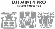
I have a vinyl cutter and saw templates for my drone (DJI mini 4). The templates seem quite complex and maybe I'd just do cuts for the big sections. Little vinyl pieces could come loose easily, I'd think. Who knows?
I saw some examples of how people had decorated their drones, including someone who had done theirs in camo. I thought it would be cool to have a camo drone but then thought, NO! It's going to blend with trees. Lose it and you'll never find it.
So I was thinking "sky blue". No, bad idea. Even the natural color is kind of a bad idea for the sky.

Maybe fluorescent green? Maybe Candy Apple Red glitter? The options are endless.

So, what have you all done?
Do not use a sharpie or anything perminant. It will get messy if you want to sell your drone later on.

It is a good idea to include contact info on your drone along with the required registration number. I got my drone returned to me intact a month later because I had it labeled.

Blog Story about labeling your drone (Why Label Your Drones? - Drones Scapes: We Fly... We Produce... We Deliver...)
 
Blog Story about labeling your drone
The "Find My Drone" feature doesn't expose much data. Had you used a flight log viewer to view your flight log data, you likely would have been able to track it down.
 
Today I downloaded the templates for the Mini 4 Pro.
Trying to decide what color will be most visible in the sky.
Maybe fluorescent green?

I could do a two tone.

I kind of want to do red glitter though.
 
Today I downloaded the templates for the Mini 4 Pro.
Trying to decide what color will be most visible in the sky.
Maybe fluorescent green?

I could do a two tone.

I kind of want to do red glitter though.
These are my top 3:

To view this content we will need your consent to set third party cookies.
For more detailed information, see our cookies page.
To view this content we will need your consent to set third party cookies.
For more detailed information, see our cookies page.
To view this content we will need your consent to set third party cookies.
For more detailed information, see our cookies page.
 
  • Like
Reactions: justhangingaround
I like the green. Maybe with some black highlights.
The skin cut pattern has about 100 segments.
I could cut two colors and just switch out which ones to put on.
1736035495112.png
 
Last edited:
  • Like
Reactions: justhangingaround
the green is cool!
 
Today I downloaded the templates for the Mini 4 Pro.
Trying to decide what color will be most visible in the sky.
Maybe fluorescent green?

I could do a two tone.

I kind of want to do red glitter though.

Reds and oranges stand out best against blue. Same reason red/blue were used for old 3D movies. It's because they're far apart in frequency, so there's very little overlap in sensitivity of blue and red cones on the retina in responding to the opposite color.
 
Last edited:
  • Like
Reactions: Bad Santa
Reds and oranges stand out best against blue. Same reason red/blue were used for old 3D movies. It's because they're far apart in frequency, so there's very little overlap in sensitivity of blue and red cones on the retina in responding to the opposite color.
The cones in your eyes are RGB so green should show in contrast as much as red. It's also why color blindness is problems between red and green. Those cones develop too close together.

~Unnecessary flex
Not that it matters but I was born with extremely good color differential. It's served me well when I was in a color-related business. I had to have my color recognition tested regularly and always scored the highest.
 
If found you can keep it??
WOW!
Ha yeh only because it never get lost,its pretty shy and dont get out much
Hey yeh to while I'm with Santa, you missed my house out this year lol 🤣 but I can wait till next one
 
The cones in your eyes are RGB so green should show in contrast as much as red. It's also why color blindness is problems between red and green. Those cones develop too close together.

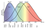
Nope. Contrast is about rejection. The response curves of the the cones on your retina look like gaussian curves:

1000021137.png

The larger overlap between green and blue sensitivity causes green to stimulate blue cones more than red, thereby making it harder to discriminate against a blue background as it's stimulating blue receptors too.

As I said, this is why red/blue was chosen for old-style 3D glasses... Because there's better rejection of the opposite color, separating left/right steroscopic images.

Red/green results in seeing a shadow of the other image in each eye, wrecking the 3D effect. Red/green have the worst rejection, as can be seen in the chart.

Color blindness, which is the result of a missing cone type, has nothing to do with this at all.

Last post on this topic. I happen to know this particular issue with absolute certainty, have explained it for anyone actually interested, and have no desire to argue with armchair quarterbacks posting from their basement in a wife-beater with cheetos stained fingers.

You all are free to believe whatever wrong things you like. I care not.
 
Nope. Contrast is about rejection. The response curves of the the cones on your retina look like gaussian curves:

View attachment 180339

The larger overlap between green and blue sensitivity causes green to stimulate blue cones more than red, thereby making it harder to discriminate against a blue background as it's stimulating blue receptors too.

As I said, this is why red/blue was chosen for old-style 3D glasses... Because there's better rejection of the opposite color, separating left/right steroscopic images.

Red/green results in seeing a shadow of the other image in each eye, wrecking the 3D effect. Red/green have the worst rejection, as can be seen in the chart.

Color blindness, which is the result of a missing cone type, has nothing to do with this at all.

Last post on this topic. I happen to know this particular issue with absolute certainty, have explained it for anyone actually interested, and have no desire to argue with armchair quarterbacks posting from their basement in a wife-beater with cheetos stained fingers.

You all are free to believe whatever wrong things you like. I care not.
Aren't you a ray of sunshine.

I wasn't going to argue with you about it.
And, for the record, I'm sitting in a Lay Z Boy recliner in front of a 75" TV (not on) wearing a "hawaiian" style shirt with jellyfish on in that I designed myself. And I haven't eaten Cheetos in years, but will be visiting my Chinese friend for lunch in a couple hours.
I do wish I had a basement, though. My garage is kind of small and my lathe and mill take up too much space.
 
Aren't you a ray of sunshine.

1*P-KoKSFpjRQJyLapyHFoDw.png

I wasn't going to argue with you about it.
And, for the record, I'm sitting in a Lay Z Boy recliner in front of a 75" TV (not on) wearing a "hawaiian" style shirt with jellyfish on in that I designed myself. And I haven't eaten Cheetos in years, but will be visiting my Chinese friend for lunch in a couple hours.

What makes you think I was talking about you?

Someone else, truly.
 
I already have black and orange so I ordered neon green, neon pink and a couple versions of retroreflective vinyl.
Gives me a lot of different ways to decorate the little guy.

One of the versions of retroreflective vinyl is black unless a light hits it, then it's reflective. If all works out well with the tests of that, I'll probably go with the green/RR-black as a theme.

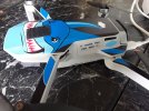
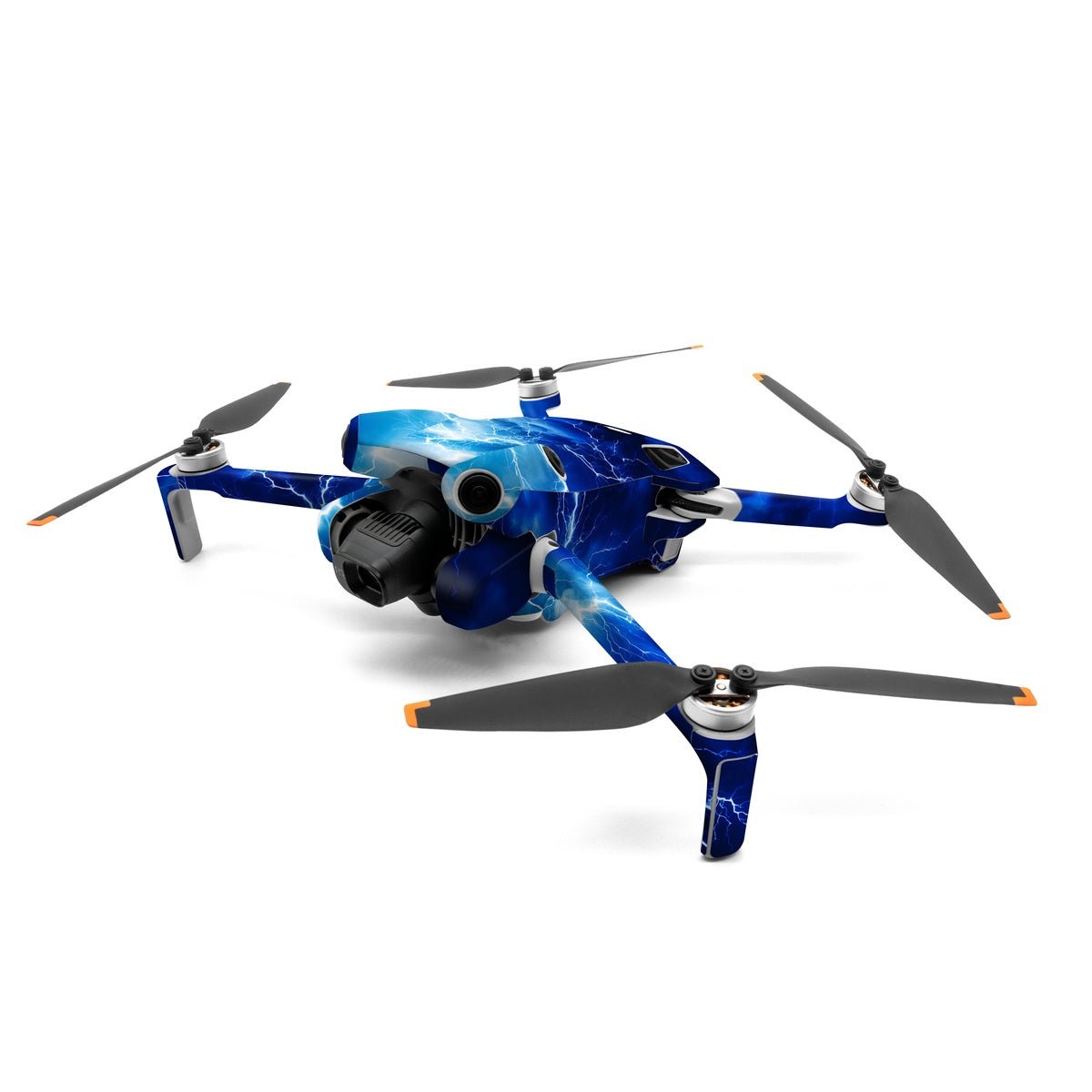
BTW, just for full disclosure I have my M4P wrapped with the most standout contrasty pattern... NOT! Apocalypse Blue from Decal Girl, chosen not for visibility but because I think it a very cool skin:

apocalypse-blue-dji-mini-4-pro-skin-gaming-674004.jpg
 
  • Like
Reactions: Bad Santa

DJI Drone Deals

New Threads

Members online

Forum statistics

Threads
135,564
Messages
1,607,396
Members
164,002
Latest member
urfantasyguy
Want to Remove this Ad? Simply login or create a free account