

- Joined
- Nov 22, 2017
- Messages
- 339
- Reactions
- 44
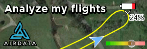
Can someone specify what the different points and colors mean exactly on the battery status bar? 
For example:
#6 - Flight time remaining until what point? (battery at 0% or forced autoland or RTH warning or else)?
For example:
#6 - Flight time remaining until what point? (battery at 0% or forced autoland or RTH warning or else)?