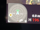
Orientation Indicator Moved, Actually gone if I keep the map view in the smallest option in the bottom left corner. THOUGHTS? OPINIONS?
As I recall the orientation location icon was alway in 2 of the 3 map view options, I Sometimes I found it necessary to immediately go to full screen map view when I received my manned aircraft in area notification, I take that notification very serious so yes as soon as it appears I go into full screen map and immediately check my orientation and altitude while the screen tends to take about 2 seconds to show me the manned aircrafts location and flight path direction. It’s the best screen for me to view in this situation as it is the most simple screen view to look at as every single object / info I need to make immediate flight corrections and on that screen view their is perfect contrast for everything displayed. BUT I DONT AND THINK MOST OTHERS WILL AGREE THAT THEY DONT FLY IN THAT MODE 100% OF THE TIME. SO ????? why remove the orientation indicator that took up minimal space and was slightly transparent from the “live view” screen display option?
To me it was centered in the perfect spot, and was perfectly placed next to the other important information on that screen view, does anyone feel that a quick glance down to see your altitude, speed, and flight direction/orientation all lined up was a nice feature? If flying while maintaining a vlos is priority number 1, shouldn’t certain extremely important flight control information on all screens be located exactly in the same place on all screen view options? With the use of font / icon transparency tools be controlled either automatically by the software or individually based on personal preference, while still having those ( which I think are 3 of the of the most important flight tools that are on screen for safe flying ) available in the same spot on all screens.
I prefer using my iPad vs my iPhone XR while flying for a few reasons, it much easier for me to glance down and see all the info I want in 1 quick look, all my flight screen icons are larger, a better / funnier overall experience while flying, safer flying as all my info is larger ( did I mention that a hundred times) and most important for me ( and any suggestions are welcome ) my glass screen protector on my iPad has ZERO air spots between my screen and protector, and this is the original screen protector I installed almost 3 years ago. Yes their are a couple what I call hairline stress cracks in the protector that I notice at certain angles, but no way a reason to change the protector.
As for my iPhone XR, obviously a smaller screen makes for smaller fonts and icons, and in just over a year I think I’m on my 6th glass screen protector as within a week ( probably due to the slight curved edge of phone screen ) the edge lifting of the protector starts and continues to spread around the whole outer edge of the screen, and yes I’ve tried all of the stopping screen protector hacks that I could find. Sorry I’m off topic but it leads back into flight safety ( kinda I guess)
Why would the software company want us to spend more time flipping through screen view modes for important information taking away any ability of live vlos at all times? With all the new drone owners due to the holidays and possibly pandemic isolation syndrome, it must be confusing for new operators to get all their info in 1 place while getting the the extremely valuable important flight experience time under their belt.
LAST THING TO ADD AS I JUST THOUGHT OF THIS
Why take away the crafts orientation indicator on any screen for a craft that does not have side and top sensors? When I go a few days without flying, I have my own personal safety checks ( in addition to the obvious preflight checks). I learned from experience, some bad experiences to double check all info on all tabs in the software as they have defaulted back to different settings then I prefer, and with all the add ons to the software since inception there seems to be many more options intended for operators that have a good feeling for their craft and experience level, that may not be intended for the first time out of the box user. After I insure my new home point ( which lately has been taking a while due to lower satellite connects than a few weeks ago) and hover at about 21 feet for a little bit, I then fly over about 10-20 feet and come down to approx 5-7 feet high and check my sensors in tripod and normal mode usually on the same tree and bush when flying from home, and slowly approach them to visually see the screen indicators, while listening to the beeping, the visually watching the drone react and maneuver around a known object, and if flying away from home I do the same but actually use my car as the object ( I would rather use my car as a test then no test and damage another parked car). Then once I feel comfortable I fly, otherwise I go back to home point manually and start process over until everything reacts as anticipated. THIS CREATES A HUGE AMOUNT OF PEACE OF MIND WHILE IN FLIGHT.
OK enough typing, the rain clouds have cleared up and it’s time to fly and trace my kids on their new longboard skateboards ( from a distance of coarse, with the recent video zoom addition)
WAIT could removing info slowly from the live screen actually be an attempt to helping live streamers from giving up their flight info to the authorities in real time? If so they should just make a clear live view screen option so we can choose what info we want
Sorry for the poor grammar, and off topic thoughts and super long post


")