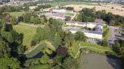
I like the image generally, but since you asked, I think a critique might help you in the future.
I think you have to be more judicious in evaluating your edits. Have you looked at the histogram? Below you will see your image with a histogram on top of the original image (which I may have altered a tad). Your image is clearly over-exposed, the #1 no-no of digital imaging. If you look at the histogram, you've spiked the highlights (on the right) in which detail is unrecoverable. On the left you will see some space that indicates you did not capture any blacks without detail.
The first thing I noticed is that you should simply bump your black point, which will help a lot. the mid tones appear to be find and the contrast will come back by bumping the blacks. However, the white buildings, while they can be lowered a bit in tone will always have a painted look because there is no white with detail in the file. A rule of thumb in digital exposure; it is better to be a bit underexposed than overexposed. NEVER overexpose and image unless you have an intentional purpose for doing so. An HDR merge might be one reason for doing so. or some special effect. But I can't think of any other instance.
Compositionally, I think when you decided to capture images, look for a central point of interest and ask yourself "Why am I taking this image?". Asking yourself this on each and every shot, until it becomes natural instinct will help make your images more dynamic.
View attachment 134941