Please offer any constructive comments! On my channel I also have one video from five years ago of a similar tower, just a plain video, overexposed (it seems), so this is a "remake" one could say).
You are using an out of date browser. It may not display this or other websites correctly.
You should upgrade or use an alternative browser.
You should upgrade or use an alternative browser.
Pro Possibly last video before 16th RIDs me of filming capabilities (at least for a while)
- Thread starter MKurr
- Start date
Overall, it's good. Music definitely fit. Scenery is really good.
One spot (2:00- ish) was a bit "spinny." Had the dizzying effect. A couple of scenes seemed to be duplicate.
One spot (2:00- ish) was a bit "spinny." Had the dizzying effect. A couple of scenes seemed to be duplicate.
Thanks!Overall, it's good. Music definitely fit. Scenery is really good.
One spot (2:00- ish) was a bit "spinny." Had the dizzying effect. A couple of scenes seemed to be duplicate.
Yeah, that shot, I wasn't sure if I should use it, it's rather long as well and that was my main concern, but it shows the area, and adds "action" in a sense...
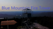
Right now I'm trying to figure out what "thumbnail" photo to use. I think the one I had was overcrowded and uninteresting, this one... maybe the same.
Any ideas anyone?
Any ideas anyone?
Rhody Seth
Well-Known Member
Right now I'm trying to figure out what "thumbnail" photo to use. I think the one I had was overcrowded and uninteresting, this one... maybe the same.
Any ideas anyone?
The picture itself isn't bad, though it is dark. There is way too much text though. A bit of text can be good but it should stand out. The "Epic Aerial Drone View" 3D look frankly reminds me of a 90s PC game. Getting rid of all the rest of the text and then centering "Blue Mountain Fire Tower" in front of (or behind) the tower would make for a much cleaner thumbnail.
Remember that people are getting served this thumbnail along with numerous others at the same time. It needs to grab their attention immediately or they'll gloss right over it.

If I then keep the same style/picture, basically this then?The picture itself isn't bad, though it is dark. There is way too much text though. A bit of text can be good but it should stand out. The "Epic Aerial Drone View" 3D look frankly reminds me of a 90s PC game. Getting rid of all the rest of the text and then centering "Blue Mountain Fire Tower" in front of (or behind) the tower would make for a much cleaner thumbnail.
Remember that people are getting served this thumbnail along with numerous others at the same time. It needs to grab their attention immediately or they'll gloss right over it.
Also, I mean, sometimes it's far better even if the picture is nowhere in the video, maybe I could try designing something with a map, rating stars, Adirondacks logo, drone, etc...
Rhody Seth
Well-Known Member
Today I did some research about how to make them better, so soon I'll try to come out with a totally redesigned version.)That's definitely an improvement, at least to my eyes!
Similar threads
- Replies
- 4
- Views
- 885
- Replies
- 3
- Views
- 2K
- Replies
- 7
- Views
- 1K
- Replies
- 16
- Views
- 2K
Share:
DJI Drone Deals
New Threads
-
-
-
Advice Please! My 2s needs repair should I sell, repair, buy new?
- Started by Greatsign1
- Replies: 5
-
-
Members online
Total: 356 (members: 10, guests: 346)


